Lesson 1
Image size, resolution, and mode
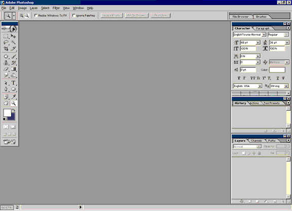 When you first open Photoshop, you should have a blank working space
with various menus, as in the image (right). The displayed menus and
their locations are customizable, so your screen may look slightly
different, but in general it should have a similar overall appearance.
First, take a look at the menu bar that runs horizontally across the top of the screen.
When you first open Photoshop, you should have a blank working space
with various menus, as in the image (right). The displayed menus and
their locations are customizable, so your screen may look slightly
different, but in general it should have a similar overall appearance.
First, take a look at the menu bar that runs horizontally across the top of the screen.
There are various ways to acquire an image with which to begin working. You can create a new file, open an existing file saved on your computer's hard drive or a data disk, or import an image from an attached device such as a scanner. I will talk about each of these methods in turn.
To open a new file, click on the first item on the menu, "File." You should see a pull-down menu.
Many commands can be activated by using combinations of keystrokes rather than relying on the mouse. Depending on the situation, these keyboard shortcuts may save time. It is a good idea to remember the shortcut combinations for the commands you use most often.
To see the File menu, press the Alt and F keys simultaneously, indicated by the shorthand Alt + F.
 Once the pull-down File menu is open, you can see that the first list
item is "New," which creates a new, blank image. Click on "New" to bring
up the corresponding dialogue box. The shortcut for opening a new image
is Ctrl + N.
Once the pull-down File menu is open, you can see that the first list
item is "New," which creates a new, blank image. Click on "New" to bring
up the corresponding dialogue box. The shortcut for opening a new image
is Ctrl + N.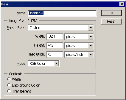 You should see a dialogue box similar to the one on the right. This
dialogue box determines the properties of the new image. You can simply
press the Enter key or click the "OK" button to open an image with the
default settings and then change the settings later if required, but it
is more convenient to be able to enter the correct settings right from
the start.
You should see a dialogue box similar to the one on the right. This
dialogue box determines the properties of the new image. You can simply
press the Enter key or click the "OK" button to open an image with the
default settings and then change the settings later if required, but it
is more convenient to be able to enter the correct settings right from
the start.In the "Name" field, you can enter a name for the image. If you don't know yet what you want to call your image, you can leave this untitled and give it a name later when you save your work.
The next section deals with the size of the image. You can manually enter values for the width and height, choosing from a selection of different units, including pixels, millimeters, and inches.
Below the width and height fields is a place to enter the desired resolution. The images you work with in Photoshop are composed of pixels, or "dots," and the resolution determines how many of these dots will be assigned per inch of the image. Resolution is usually measured in "dots per inch" or "d.p.i." The higher the resolution, the clearer and more detailed the image will be. However, images at high resolution also take up more memory, since the computer has more pixel information to store.
It is important to choose the resolution best suited for your purpose. It is far easier to take a high-resolution image and make it smaller than to enlarge a low-resolution image. Once an image is at a low resolution, enlarging it does not give it any greater detail, it will instead look blurry or pixelated. Images intended to be displayed on computer screens are generally set at 72 d.p.i. Images intended for printing should be at least 300 d.p.i. For photo-quality images, you may want to go up to 600 d.p.i.
Changing the resolution without changing the size will make the image appear either larger or smaller on your screen. This is because the computer screen has a fixed resolution. If you increase the number of pixels per inch of the image, the computer screen has to make the picture larger to compensate, because it can't change the number of pixels per inch of the display. Correspondingly, if you decrease the resolution, the picture will appear smaller. However, the size of the image when printed out will not change, because a printer can print at many different resolutions. Instead, the image will look sharper or more blurry.
Below the resolution field is a place to select the image mode. This determines the way colors are handled in the image. You have five choices: Bitmap, Grayscale, RGB Color, CMYK Color, and Lab Color.
Bitmap
Bitmap images are only in black and white. You will generally not use this mode unless you are doing an extremely simple drawing. You may wish to use it when designing a custom brush, but it isn't necessary.
Grayscale
Grayscale images range from black to white with many shades of gray in between. You may wish to use this mode if you intend to print with a black and white printer or if your image is going to be photocopied. You might also use it when scanning in images if the original itself has no color, such as an ink drawing.
RGB Color
This stands for "red green blue" and represents a mode of color selection that determines each color based on its red, green, and blue values. These are the "primary colors" of mixing wavelengths of light. RGB Color mode is used for images intended to be viewed on computer screens or for general home color printing.
CMYK Color
This stands for "cyan magenta yellow black." Each color in this mode is determined by four values for the four colors of ink used in color printers. This color mode is used by professional printing companies.
Lab Color
This is a mode in which the colors are based on the three factors of luminosity, green-red, and blue-yellow. You will probably never use this mode.
Once you choose the size, resolution, and mode that you desire for your image, you may select what color (if any) you want for the background. All of these values can be adjusted after the image has been created, so with the exception of resolution as noted earlier, you shouldn't worry too much about getting them exact at first.
If, rather than creating a new image, you wish to open a stored image, click "Open" instead of "New" in the File menu. The shortcut for this command is Ctrl + O. When you do so, an explorer window will open that allows you to browse through the contents of your computer for files. Simply click on the desired image and hit the Enter key or click "Open."
In the explorer window, you can open multiple images at the same time. Open multiple contiguous files by holding down the Shift key while clicking on the first and last image. Open multiple non-contiguous files by holding down Ctrl while clicking on each individual image.
If you intend to scan an image, you must first make sure you have a scanner connected to your computer and that the correct drivers are installed. When such preparations are taken care of, you can scan an image by going to the File menu and clicking "Import." Various options will appear; select the one that pertains to your scanner.
As with creating a new image, you will need to determine the proper scanning mode and resolution to suit your purposes.
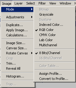 After you have opened an image, you can alter its size, resolution, and mode with the Image menu.
The first item on the menu is "Mode." In addition to the modes listed above, there is a new mode called "Indexed Color." This mode restricts the number of colors in the image to a limited palette and is used when saving images in .gif format. It is good for simple images with few colors, but if used with pictures with subtle color differences, the result will lose detail.
Below, the three main color modes that you are likely to use or encounter are illustrated.
 Grayscale |
 Indexed Color (Web) |
 RGB Color |
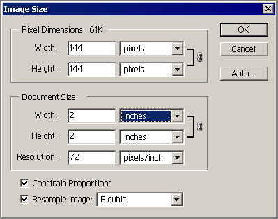 Farther down the menu is the "Image Size" item. Clicking this brings up
the "Image Size" dialogue box. With this dialogue box, you can manually
shrink or enlarge the image to the desired size.
Farther down the menu is the "Image Size" item. Clicking this brings up
the "Image Size" dialogue box. With this dialogue box, you can manually
shrink or enlarge the image to the desired size.The important thing to note about this dialogue box is the icon of a chain linking the width and height. While this chain is showing, changing either the width or the height alters the other dimension so that the image retains the same proportions no matter what size you input.
If you wish to alter one dimension without changing the other, click on "Constrain Proportions" to remove the check.
You can change the size and resolution at the same time, or you can change them at separate times while you work. If you decide not to change anything after opening the dialogue box you can click "Cancel." If you alter the size yet are not pleased with the result, you can undo it later.
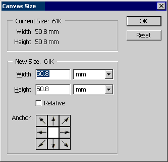 While you are working on your image, you may find that you wish to draw
or paste something beyond the edge of the picture at its current size.
To change the size of the canvas around your image without changing the
image itself, click on the Image menu item "Canvas Size." This brings up
the "Canvas Size" dialogue box.
While you are working on your image, you may find that you wish to draw
or paste something beyond the edge of the picture at its current size.
To change the size of the canvas around your image without changing the
image itself, click on the Image menu item "Canvas Size." This brings up
the "Canvas Size" dialogue box.In this dialogue box, changing the width or height leaves the original image in the center of the canvas. If you want to anchor one side or corner of the image to the edge or corner of the canvas, click the appropriate arrow in the "Anchor" section.
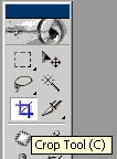 If you need to crop excess portions of your image, you may use the Crop
tool from the toolbar. Click on the Crop tool icon, then click and drag
the cursor across the image to frame the portion that you wish to keep.
You can alter the area to be cropped by clicking and dragging on the
handles of the cropping frame. When you are satisfied with the result,
you can perform the crop by clicking on the checkmark at the upper right
side of the workspace, double-clicking on the image, or hitting the
Enter key. Below is an illustration of the cropping process.
If you need to crop excess portions of your image, you may use the Crop
tool from the toolbar. Click on the Crop tool icon, then click and drag
the cursor across the image to frame the portion that you wish to keep.
You can alter the area to be cropped by clicking and dragging on the
handles of the cropping frame. When you are satisfied with the result,
you can perform the crop by clicking on the checkmark at the upper right
side of the workspace, double-clicking on the image, or hitting the
Enter key. Below is an illustration of the cropping process.
Lesson 2
Selection
This may be the most important lesson of all. The ability to select certain areas of the image in many different ways gives you the power to alter and combine images and effects to create spectacular results. There are four main ways to select areas of the image:
- The Marquee tool
- The Lasso tool
- The Magic Wand tool
- The Select menu
1. Marquee tool
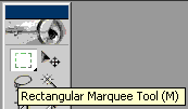 First open a stored image, then click on the Marquee tool. When your
cursor is over the image, it should look like a thin plus sign. The
center of the plus sign (or crosshairs) is the selection point.
First open a stored image, then click on the Marquee tool. When your
cursor is over the image, it should look like a thin plus sign. The
center of the plus sign (or crosshairs) is the selection point.
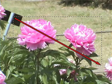 Click and drag the crosshairs across your image. A rectangular marquee
should appear, with one corner where you started dragging and the
opposite corner where you stopped. The red arrow in the picture (right)
shows the movement of the cursor.
Click and drag the crosshairs across your image. A rectangular marquee
should appear, with one corner where you started dragging and the
opposite corner where you stopped. The red arrow in the picture (right)
shows the movement of the cursor.Holding down the Alt key while dragging makes the marquee open outward with the starting point as the center, rather than a corner. This is shown by the red arrow in the picture (below).
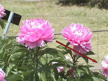 Holding down the Shift key while dragging forces the marquee to be a
perfect square. Shift + Alt combines the effects of both keys and makes
the square open from the center point.
Holding down the Shift key while dragging forces the marquee to be a
perfect square. Shift + Alt combines the effects of both keys and makes
the square open from the center point.After you have selected an area of the image with the Marquee tool, the cursor changes its appearance to look like a small marquee with an arrow when held over the selected area. This cursor affects only the marquee itself.
Clicking anywhere in the image will make the marquee disappear, deselecting the area. If you click and drag inside the selected area, you can move the marquee's position to select a different place on the image. You can also move the marquee by using the arrow keys.
Look at the top of the screen, directly beneath the main menu bar. You should see the Marquee menu.

First look at the area beneath the number 1 in the picture (above). This determines the properties of the selection area. The default is that you can only select one area at a time with the Marquee tool. If you try to select a second area, the first marquee will disappear, to be replaced by the second one.
If you click on the second icon in this section, which shows two overlapping squares, it allows you to select multiple areas. Each successive marquee will add its area to the previous ones. They can be either contiguous or non-contiguous.
The third icon in this section allows one area to subtract from another. After you have selected an area, click on this icon. Select another area overlapping the first, and the new selection area will be subtracted from the first. These "subtraction" areas must overlap the initial selection. If you try to select an area outside the portion surrounded by the marquee, nothing will happen.
The fourth icon selects only the junction between two selection areas. Select part of your image and then click on this icon. Select an overlapping part of the image, and only the area where the two selections overlapped will remain selected. Selecting on an area that does not overlap will give you a warning message and deselect everything.
Now look at section two, "Feather." This allows the edge of your selection area to be gradual rather than sharp. The higher the number you enter in this box, the more the edge is blurred.
The box under the number three will only be active if you use the Elliptical Marquee explained below. Anti-aliasing is a process that smooths out edges gradually. If you have a high resolution image, it is probably a good idea to leave this box checked, because the smoothness will look more pleasing. However, if you are doing low-resolution work, or if you want a cleaner, sharper edge, uncheck this box.
Section four alters the properties of the marquee. The default style, "Normal," allows you to determine the width and height of the marquee separately as you drag. If, however, you change this style to "Fixed Aspect Ratio," you can form a marquee that has the width and height set at a constant proportion. You determine this proportion by typing the ratio in the "Width" and "Height" fields in section five.
If, instead of dragging the marquee to the desired size, you wish to determine the size of the marquee by a specific width and height, change the style to "Fixed Size." You can then input the width and height that you need in the section five fields.
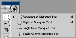 Return to the tool bar. Click and hold on the Marquee tool. A menu will
appear showing you different types of Marquee tools that are available.
Click on the second option, the Elliptical Marquee tool.
Return to the tool bar. Click and hold on the Marquee tool. A menu will
appear showing you different types of Marquee tools that are available.
Click on the second option, the Elliptical Marquee tool.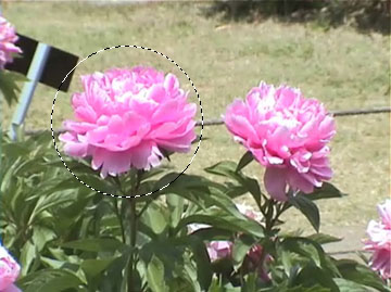 This tool allows you to select round or elliptical areas. The commands
work exactly the same as for the Rectangular Marquee tool. For example,
holding the Shift key while dragging will select a perfect circle, as in
the picture (right).
This tool allows you to select round or elliptical areas. The commands
work exactly the same as for the Rectangular Marquee tool. For example,
holding the Shift key while dragging will select a perfect circle, as in
the picture (right).2. Lasso tool
 The Marquee tool is extremely useful, but sometimes you need to select
an irregular area that can't be done with plain rectangles or ellipses.
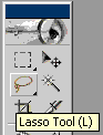
In this case, you will want to use the Lasso tool. Click on the Lasso
icon in the tool bar. Your cursor will look like the loop of a lasso.
The dangling tip of the rope is the selection point.
Click and drag to encompass an area of your image. As soon as you let go
of the mouse button, the final point will automatically connect itself
in a straight line with the starting point to form a closed loop. This
loop is your selection area.
The Marquee tool is extremely useful, but sometimes you need to select
an irregular area that can't be done with plain rectangles or ellipses.
In this case, you will want to use the Lasso tool. Click on the Lasso
icon in the tool bar. Your cursor will look like the loop of a lasso.
The dangling tip of the rope is the selection point.
Click and drag to encompass an area of your image. As soon as you let go
of the mouse button, the final point will automatically connect itself
in a straight line with the starting point to form a closed loop. This
loop is your selection area.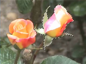 You can use the Lasso tool to surround an object that you want to
separate from the background, as in the picture (right). The Lasso tool
also has a menu bar (below), similar to the menu for the Marquee tool.
You can use the Lasso tool to surround an object that you want to
separate from the background, as in the picture (right). The Lasso tool
also has a menu bar (below), similar to the menu for the Marquee tool.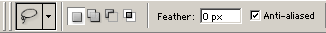
Using the addition, subtraction, and overlap functions of the Lasso tool, you can alter and fine-tune your selection area, as in the picture (below).
 As with the Marquee tool, the Lasso tool also has different types. You
can see the choices by clicking and holding on the Lasso icon in the
tool bar, as shown in the picture (below, right).
As with the Marquee tool, the Lasso tool also has different types. You
can see the choices by clicking and holding on the Lasso icon in the
tool bar, as shown in the picture (below, right).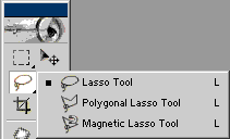 The second choice on the list, the Polygonal Lasso tool, allows you to
create a selection area by clicking in various places on the image
instead of dragging. Each place that you click forms a corner of a
polygon. The corners are automatically connected by straight lines. You
can close the loop of the polygon either by clicking on the starting
point or by double clicking.
The second choice on the list, the Polygonal Lasso tool, allows you to
create a selection area by clicking in various places on the image
instead of dragging. Each place that you click forms a corner of a
polygon. The corners are automatically connected by straight lines. You
can close the loop of the polygon either by clicking on the starting
point or by double clicking.With the Magnetic Lasso tool, the computer assists you in placing the outline of the selection area. It uses clues such as differences in color or brightness to recognize the outline of the object you are trying to select, and the selection area is "magnetically attracted" to this outline. With this tool, you don't have to worry about having a steady or precise hand, because the computer does the work of remaining true to the outline on your behalf.
The drawback, however, is that if the outline of the object fades into the background, the computer can't tell the difference and the "magnetic" effect doesn't work properly. You may have to use the addition or subtraction properties to clean up the resulting selection area to your satisfaction.
3. Magic Wand tool
Now, what if you want to select an area that's all one color? You could spend time carefully outlining the area with the Lasso tool, but there is a much faster shortcut. You can use the Magic Wand tool.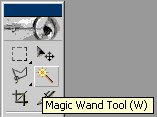 Click
on the Magic Wand icon in the toolbar. Your cursor will now look like a
wand. The sparkly tip of the wand is the selection point. Click the
wand on the image, and it will select an area of the same or similar
color as the point that you touched.
Click
on the Magic Wand icon in the toolbar. Your cursor will now look like a
wand. The sparkly tip of the wand is the selection point. Click the
wand on the image, and it will select an area of the same or similar
color as the point that you touched. Look at the Magic Wand menu. Just like the Marquee and Lasso tools, it
also has addition, subtraction, and overlap modes. However, it has a new
property: "Tolerance." The tolerance tells the computer how similar in
color a neighboring pixel must be in order to be selected. A low
tolerance means that the computer is very discriminating and the color
must be almost exactly the same. A high tolerance means that the
computer's judgment is looser and the color can be somewhat different.
The pictures below illustrate clicking on the same point with different
tolerance levels.
Look at the Magic Wand menu. Just like the Marquee and Lasso tools, it
also has addition, subtraction, and overlap modes. However, it has a new
property: "Tolerance." The tolerance tells the computer how similar in
color a neighboring pixel must be in order to be selected. A low
tolerance means that the computer is very discriminating and the color
must be almost exactly the same. A high tolerance means that the
computer's judgment is looser and the color can be somewhat different.
The pictures below illustrate clicking on the same point with different
tolerance levels.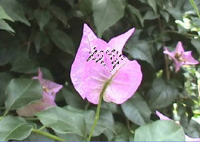 Tolerance: 10 |
 Tolerance: 25 |
 Tolerance: 50 |
4. Select menu
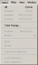 You can select areas of the image using the Select menu. First, you can
select the entire image by choosing "All." The keyboard shortcut is Ctrl
+ A. Once a selection has been made and you no longer need the
selection area, you can choose "Deselect" to get rid of the selection.
The shortcut for this is Ctrl + D. If you then want to select the exact
same area again, you can choose "Reselect."
The fourth item on the menu, "Inverse," is a handy function. It is often
desirable to select a small area and then invert the selection so that
everything except that area is selected. This can save you a great deal of time and can also be used to create interesting effects.
You can select areas of the image using the Select menu. First, you can
select the entire image by choosing "All." The keyboard shortcut is Ctrl
+ A. Once a selection has been made and you no longer need the
selection area, you can choose "Deselect" to get rid of the selection.
The shortcut for this is Ctrl + D. If you then want to select the exact
same area again, you can choose "Reselect."
The fourth item on the menu, "Inverse," is a handy function. It is often
desirable to select a small area and then invert the selection so that
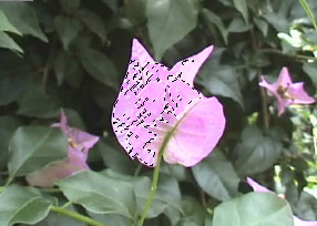
everything except that area is selected. This can save you a great deal of time and can also be used to create interesting effects.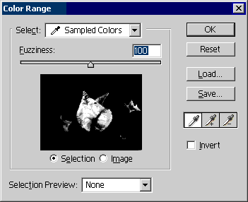 You can select areas of the image in a similar fashion to the Magic Wand
tool by choosing the Color Range option. When you click on this menu
item, the Color Range dialogue box will appear. Your cursor will change
to look like an eyedropper. You can use this eyedropper to sample a
pixel color from your image, and like the non-contiguous Magic Wand,
similar colors across the entire image will be selected.
You can select areas of the image in a similar fashion to the Magic Wand
tool by choosing the Color Range option. When you click on this menu
item, the Color Range dialogue box will appear. Your cursor will change
to look like an eyedropper. You can use this eyedropper to sample a
pixel color from your image, and like the non-contiguous Magic Wand,
similar colors across the entire image will be selected.The benefit of using the Color Range dialogue box to make your selection is that you can see the area that will be selected in the black and white preview box. In the preview, the selected area is shown in white and the area not selected is shown in black. You can use your eyedropper to sample either from the original image or from the preview box, and you can keep making adjustments until you are satisfied with the selection area.
The "Fuzziness" scale above the preview box is like the tolerance factor for the Magic Wand. The higher the fuzziness, the more is selected.
To the right of the preview box are three eyedropper icons. The default allows only one color sampling at a time. If you click on the "+" eyedropper icon, any subsequent pixel colors that you sample will be added to the selection. If you click on the "-" eyedropper icon, any subsequent pixel colors that you sample will be subtracted from the selection. You can click on the "Invert" box to invert the selection area. When the selection is the way you want it, either hit the Enter key or click "OK."
 After you have selected an area of the image, you can use the Select
menu to alter the selection area. The "Feather" menu item acts the same
as "Feather" in the Marquee menu, discussed earlier.
After you have selected an area of the image, you can use the Select
menu to alter the selection area. The "Feather" menu item acts the same
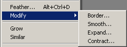
as "Feather" in the Marquee menu, discussed earlier.Clicking on "Modify" will bring up a sub-menu of options.
- "Border" allows you to determine a border of a specified size around the edge of the selection, like a picture frame.
- "Smooth" will smooth out any corners of the selection. This is convenient if you used the Rectangular Marquee tool to make your selection but you would like rounded corners. It can also round the corners of individual letters if you have added text to your image, allowing you to alter the appearance of the font.
- "Expand" will increase the selection area by a specified number of pixels.
- "Contract" will decrease the selection area by a specified number of pixels.
Lesson 6
Layers
 Layers
are amazingly powerful when it comes to drawing or editing images,
especially if you want to add special effects to your picture. Knowing
how to use the Layers palette to manipulate layers and their properties
will allow you to spruce up your work immensely.
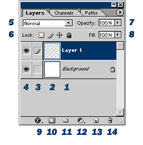
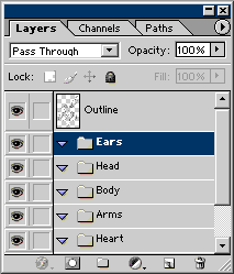
Take a look at the Layers palette (left). It's packed with lots of
helpful shortcuts and functions. I've numbered the fourteen items
visible in this image, though more icons appear when you start adding
and manipulating layers.
Layers
are amazingly powerful when it comes to drawing or editing images,
especially if you want to add special effects to your picture. Knowing
how to use the Layers palette to manipulate layers and their properties
will allow you to spruce up your work immensely.
Take a look at the Layers palette (left). It's packed with lots of
helpful shortcuts and functions. I've numbered the fourteen items
visible in this image, though more icons appear when you start adding
and manipulating layers.1. Name of the layer. When you open an image, the layer that appears is automatically considered the background. Adding more layers stacks them on top of the background. The image that you see in the workspace window is the view from the top down, looking through all the layers as if they were sheets of plastic stacked on top of each other. If you only use one or two layers, you probably don't have to worry about what they are called in the palette. If you start editing images with multiple layers, though, you may want to rename each layer to describe the contents of the layer so that you can find it again easily. You can rename any layer (except the background) by double clicking on its name and typing the name you have chosen.
2. Layer thumbnail. This is a tiny picture showing the contents of the layer. The gray and white checkered pattern indicates that the layer is transparent, like a blank sheet of clear plastic.
3. "Link" box. The active layer, in addition to being highlighted in blue, will have a paintbrush in this box. For the non-active layers, if you click in this box, an icon of a chain will appear. This chain icon indicates that the layer is "linked" to the active layer. If you move the active layer, any linked layers move along with it. This is particularly helpful if you have an object in one layer and its shadow in another, for example, and you want to move both the object and the shadow together. You can "unlink" a linked layer by clicking on the chain, making it disappear.
4. Layer visibility icon. Turning a layer invisible can serve many purposes. The main reason to make a layer invisible is so that you can see the layer(s) beneath it, but you may also do so to exclude it from actions such as merging multiple layers. Clicking on the eye icon toggles the visibility of the layer.
5. Blending mode. This determines how each layer blends with the layer beneath it. In "Normal" mode, each layer is handled as if it were paint on a sheet of plastic. In other blending modes, the computer will blend the colors of the layer with the colors of the layer directly beneath it. This blending can have vastly different effects depending on which mode you select. This will be discussed in more detail later.
6. Lock. Locking various aspects of the layer prevents you from making unintentional changes. The first icon allows you to lock the transparent pixels. Thus, if you draw a shape on a layer and then lock the transparent pixels, you can later color on top of the shape and not worry about coloring "outside the lines." Any stray strokes you make on the transparent pixels will have no effect. The second icon locks all the pixels so that you will not accidentally paint anything once you have it the way you want it. The third icon locks the position so that you don't accidentally move the layer once you have it located where you want it. The fourth icon locks all of these aspects simultaneously.
7. Opacity. This determines how "see-through" the contents of the layer are. 100% opacity means that the layer is completely opaque, and anything painted on the layer will completely hide whatever is beneath it. Reducing the opacity allows the layer(s) under it to show through. Opacity affects everything in the entire layer.
8. Fill. This is similar to opacity, but it affects only items that are painted on the layer. It does not change the opacity of layer effects such as "Drop Shadow" or "Stroke" that may have been applied.
9. Layer Style. This is a shortcut icon that has the same effect as clicking on Layer → Layer Style. It allows you to give the objects on the layer special effects such as shadows and outlines or to emboss them in various ways. This will be discussed in greater detail later.
10. Add Layer Mask. This icon is a shortcut for clicking Layer → Add Layer Mask → Reveal All. Layer masks are used like stencils to protect the layer so that only part of what is on the layer shows through. It is like an painter putting masking tape on the canvas, so that when the masking tape is removed, that section of the canvas remains clean. Masks will be handled in a later lesson.
11. Create a new set. A "set" functions like a folder does, keeping the layers within it categorized together, separate from other layers. It is possible to apply the same thing, such as a mask, to all of the items in a set simultaneously.
12. Create new fill or adjustment layers. This icon is a shortcut for Layer → New Fill Layer and Layer → New Adjustment Layer. A fill layer is like blanketing the layer with an additional color or pattern; this is generally used in combination with masks. Adjustment layers are used to adjust the properties of a layer in much the same manner as the "Color Balance" and "Hue/Saturation" dialogue boxes, but because each adjustment has its own layer, the adjustment itself can be adjusted at any time.
13. Create a new layer. This icon is a shortcut for Layer → New → Layer. If you click on an already existing layer and drag it on top of this icon, it makes a copy of the layer.
14. Delete layer. This is a shortcut for Layer → Delete → Layer. If you drag a layer over the trash can, it deletes the layer.
This completes the overall explanation...but what does it really mean? Most of the layer options sound like gibberish without examples of what they can do, so let's start experimenting.
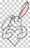
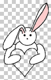
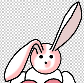
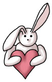
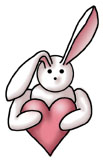
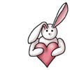
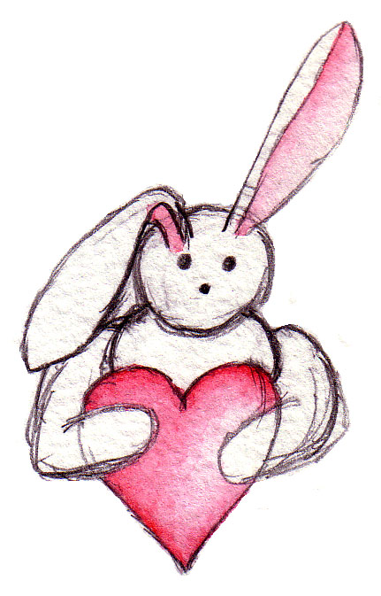 What I want to do for this lesson is take this simple bunny sketch and
turn him into a more three dimensional computer graphic. First I scanned
the bunny from my sketchbook at a resolution of 300 d.p.i. (The image
itself is quite small, but it looks large on the screen because it is at
a high resolution.) I am posting the original here so that you can
download it for practice if you wish. The remaining images of the
bunny-in-progress will all be compressed to save space.
What I want to do for this lesson is take this simple bunny sketch and
turn him into a more three dimensional computer graphic. First I scanned
the bunny from my sketchbook at a resolution of 300 d.p.i. (The image
itself is quite small, but it looks large on the screen because it is at
a high resolution.) I am posting the original here so that you can
download it for practice if you wish. The remaining images of the
bunny-in-progress will all be compressed to save space.The bunny image is automatically imported as the background. The first thing to do is to make nice, clean outlines. It is possible to use the Pen tool for this, but that is an advanced technique that will be handled in a later lesson. For now, use the Brush tool.
Click on the "create new layer" icon at the lower left of the Layers palette. This will make a new, transparent layer on top of the background. It will automatically be given the name Layer 1. Double click on this name and type in "Outline" so that you will be able to identify the contents of the layer quickly. Making certain that your foreground color is black, use the Brush tool to trace over the outline of the bunny. Use undo or the eraser as necessary to fix any mistakes. You can make the lines as thick as you like; thicker lines have a more cartoony appearance. Zoom in if you need to in order to see well enough to trace properly.
Since it is difficult to draw perfect circles, you may wish to use the Elliptical Marquee when doing the face. The key is to create a new layer first, then use the Elliptical Marquee with Fill and Stroke to make the head, eyes, and nose. That way you can move the individual parts around without disturbing the rest of the outline in order to position them properly. Once you have them where you want them, use the Eraser tool to erase the segments of the outline of the head that are hidden behind the ears.
Once you have the face drawn on its own layer, you will need to combine it with the layer beneath it. To merge the two layers together, click Layer → Merge Down. The keyboard shortcut for this is Ctrl + E. This puts the face on the same layer as the rest of the outline.
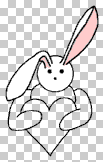
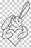 After you have finished the entire outline, click on the eye icon of the
background to make it invisible. You should have an image that looks
like the picture on the left. Check the image to make sure there are no
gaps or errors in the line. If there are, use the Brush and Eraser to
fix them.
After you have finished the entire outline, click on the eye icon of the
background to make it invisible. You should have an image that looks
like the picture on the left. Check the image to make sure there are no
gaps or errors in the line. If there are, use the Brush and Eraser to
fix them.If you only want to paint a simple, flat drawing, or a drawing that approximates the look of actual paint, you can do so quite easily with just one more layer for the color. That would not give you very much practice, however, so I'm going to make it vastly more complicated for you. (Can you feel the love? ^_~)
 Click on the background layer, then click the "create a new set" icon.
New layers and sets appear directly above the active layer. If you don't
move to the background first, the newly created set will appear above
the outline, but we want the outline to stay on top. You can always move
layers around, of course, but that would be inefficient. It's better to
create it where you want it in the first place.
Click on the background layer, then click the "create a new set" icon.
New layers and sets appear directly above the active layer. If you don't
move to the background first, the newly created set will appear above
the outline, but we want the outline to stay on top. You can always move
layers around, of course, but that would be inefficient. It's better to
create it where you want it in the first place.Double click on the set name and call it "Heart." Create a new set and name it "Arms." Repeat three more times, making sets called "Body," "Head," and "Ears." Your Layers palette should look like the picture on the left. (Again, this isn't strictly necessary, but you should know how to do it in case you ever need to in the future.)
With the Ears set highlighted as active, create a new layer. The layer will appear inside the folder (directly beneath the Ears folder icon). The thumbnail for this layer is indented to show that it is contained inside the set. Rename this layer something easy to remember. I called it "Ear base color." Select a light pink that you like as the foreground color and use it to paint the pink part of the ear. For the large ear, you can surround a large portion of the ear space with the Lasso and use Fill to save some time. You may want to make the background invisible again so you can make sure you are coloring correctly.
After you have finished the base color for the ears, repeat this process in each of the folders, working your way downward. For the rest of the body parts, you can use the Magic Wand as a shortcut. Click on the Outline layer to make it active, then tap the Magic Wand inside the relevant body part. Use Select → Modify → Expand to expand the selection by 2 pixels. Once that is done, click on the appropriate body part base color layer to activate that layer and use Edit → Fill to fill the layer with an approprate color. I used white for the bunny body parts and dark pink for the heart.
The series of pictures below illustrates this process.
 |
 |
 |
 |
 |
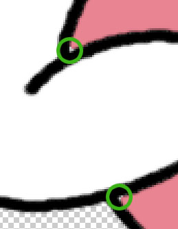 When you have finished, zoom in and check the corners. The Magic Wand
tool often leaves sharp corners unselected, as shown by the green
circles in the picture (left). If this happens, use the Brush to fill in
the gaps.
When you have finished, zoom in and check the corners. The Magic Wand
tool often leaves sharp corners unselected, as shown by the green
circles in the picture (left). If this happens, use the Brush to fill in
the gaps.Now it's time to make the bunny look more three-dimensional by painting in the shadows. It's possible to use layer effects such as Emboss to make the bunny appear three-dimensional, but that will be handled in a later lesson. For now, you should know how to use layers to paint shadows on the image.
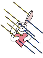 The trick to painting shadows is knowing where the light is coming from
in the image. For this example, I'm going to decide arbitrarily that the
light is coming from the upper left, as depicted by the yellow arrows
in the picture (right). Anywhere the light falls will be bright.
Wherever the light doesn't reach, illustrated by the blue arrows, will
be left in shadow. In a simple image like this bunny, you don't have to
worry too much about being an artist, just paint the shadows on the
"underside" of the curves of the body parts or wherever one part shades
another.
The trick to painting shadows is knowing where the light is coming from
in the image. For this example, I'm going to decide arbitrarily that the
light is coming from the upper left, as depicted by the yellow arrows
in the picture (right). Anywhere the light falls will be bright.
Wherever the light doesn't reach, illustrated by the blue arrows, will
be left in shadow. In a simple image like this bunny, you don't have to
worry too much about being an artist, just paint the shadows on the
"underside" of the curves of the body parts or wherever one part shades
another.Select a light gray color for the foreground and choose a feathered brush tip for the Brush tool. Click on the layer called "Head base color" and from there create a new layer. Name this "Head shadow 1." Paint the shadows of the head on this layer. If the shadow that you paint doesn't look soft enough, you can use the Blur tool to soften it. Leaving the shadows with sharp, distinct edges makes the picture look more cartoony, whereas making the shadow edges very soft and blurry makes it CG-ish. I happen to like the soft, well-blended look, but you can do whatever suits your personal style.
If you ARE an artist--or want to feel like one!--you may want to try using the Brush menu to reduce the flow of paint to 40% or lower. This makes each individual stroke fainter, but wherever you overlap strokes, the overlapped area will be darker, just like when drawing with watercolors, markers, pencils, and other physical media. You can even choose a tip for your Brush that has a texture added to it that approximates the texture of chalk or a real paintbrush.
 In this picture (left), I tinted the shadows pink so that you can see
them clearly. Follow the same process to draw shadows for the rest of
the body parts and the heart. Instead of gray, choose darker pink for
the heart shadow. (Don't do the pink part of the ears...I'll handle
those differently below.)
In this picture (left), I tinted the shadows pink so that you can see
them clearly. Follow the same process to draw shadows for the rest of
the body parts and the heart. Instead of gray, choose darker pink for
the heart shadow. (Don't do the pink part of the ears...I'll handle
those differently below.)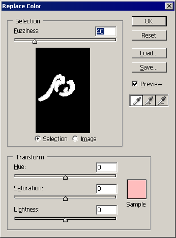 If you're not happy with the shadow color after you've painted it, you
can always change the color of that particular shadow layer by tinkering
with the color balance and hue/saturation. This is the benefit of
painting the shadow on an entirely separate layer. You can also change
the color by going to Image → Adjustments → Replace Color. This brings
up the "Replace Color" dialogue box (right). This dialogue box allows
you to select a color in a similar fashion to the Color Range function
and use the sliders to adjust the selected color to your satisfaction.
If you're not happy with the shadow color after you've painted it, you
can always change the color of that particular shadow layer by tinkering
with the color balance and hue/saturation. This is the benefit of
painting the shadow on an entirely separate layer. You can also change
the color by going to Image → Adjustments → Replace Color. This brings
up the "Replace Color" dialogue box (right). This dialogue box allows
you to select a color in a similar fashion to the Color Range function
and use the sliders to adjust the selected color to your satisfaction.Another adjustment you can make, if you think the shadows are too dark, is to reduce the opacity of the shadow layers. This makes them appear fainter, as the layer beneath them shows through. The pictures below illustrate the effect of changing the layer opacity of the heart shadow.
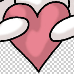 Opacity: 100% |
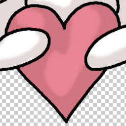 Opacity: 75% |
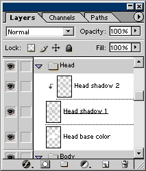 Once you have finished adding the first layer of shadows, choose a
darker shade of the same shadow color and add a second layer of shadows.
This time, click on the "shadow 1" layer, then create the new layer
directly above it. Name this the "shadow 2" layer. Next, click Layer →
Group with Previous. The keyboard shortcut for this command is Ctrl + G.
When you group a layer with the previous layer, it automatically locks
the pixels so that you cannot paint on any place that is transparent on
the previous layer. This means that when you paint the second layer of
shadows, you don't have to worry that you will color "outside the
lines." You will only be able to paint over pixels that you painted in
the "shadow 1" layer. The grouped layer thumbnail will be indented, with
an arrow pointing down to the thumbnail of the layer beneath it. The
picture (right) shows what your Layers palette should look like when you
do this.
Once you have finished adding the first layer of shadows, choose a
darker shade of the same shadow color and add a second layer of shadows.
This time, click on the "shadow 1" layer, then create the new layer
directly above it. Name this the "shadow 2" layer. Next, click Layer →
Group with Previous. The keyboard shortcut for this command is Ctrl + G.
When you group a layer with the previous layer, it automatically locks
the pixels so that you cannot paint on any place that is transparent on
the previous layer. This means that when you paint the second layer of
shadows, you don't have to worry that you will color "outside the
lines." You will only be able to paint over pixels that you painted in
the "shadow 1" layer. The grouped layer thumbnail will be indented, with
an arrow pointing down to the thumbnail of the layer beneath it. The
picture (right) shows what your Layers palette should look like when you
do this.Paint the second layer of shadows near the edge of each body part. This second layer should be significantly smaller than the first layer so that it adds a sense of depth. Don't forget to make judicious use of the Blur tool to blend the shadows.
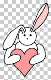
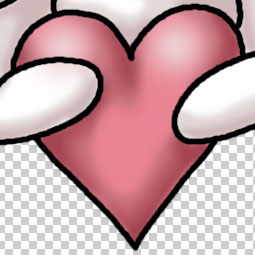
 When you're finished with the second layer of shadows, it should look
something like the picture (left). I tinted the second layer of bunny
body shadows slightly pink to give the impression of light reflecting
off the heart.
When you're finished with the second layer of shadows, it should look
something like the picture (left). I tinted the second layer of bunny
body shadows slightly pink to give the impression of light reflecting
off the heart.The bunny body is mostly white, so it doesn't really need highlights. The heart, however, could use some highlights on the upper rounded parts. On top of the "Heart shadow 2" layer, create a new layer and name it "Heart highlight." Choose a very light pink for the foreground color and a large, fuzzy brush tip for the Brush tool. You may even want to click the airbrush icon to make use of that function. Dab some round highlights where the light would hit the tip of the heart.
The pictures below show where to add the highlights.
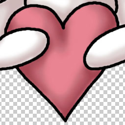 Before |
 After |
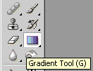 Now it's time to do the pink part of the ears. For this, I want to use
the Gradient tool. The Gradient tool allows you to paint a smooth
gradient from one color to another.
Now it's time to do the pink part of the ears. For this, I want to use
the Gradient tool. The Gradient tool allows you to paint a smooth
gradient from one color to another.First, activate the "Ear base color" layer and create a new layer above it. Call this new layer "Ear shadows" and group it with the base color layer. This way the color won't spill outside the ear. Choose for the foreground a dark pink color that you want for the darkest part of the ear shadow.
Next, click on the Gradient tool icon in the toolbar. Take a look at the menu at the top of the screen (picture below). The most important options are the first two numbered items.
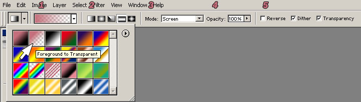 The first option lets you choose what kind of gradient you want. If you
don't like any of the options, you can create your own by right-clicking
on one of the gradient style icons and manipulating the colors and
color spacing manually. You can then save your new gradient style to use
later. This time, however, select the style indicated by the white
arrow. This makes a gradient that fades from the foreground color to
transparency.
The first option lets you choose what kind of gradient you want. If you
don't like any of the options, you can create your own by right-clicking
on one of the gradient style icons and manipulating the colors and
color spacing manually. You can then save your new gradient style to use
later. This time, however, select the style indicated by the white
arrow. This makes a gradient that fades from the foreground color to
transparency.The second option allows you to select the shape of the gradient. This time, select the very first icon. This makes the gradient proceed in a straight line.
Now you're ready to color the ear. Select the large ear section (loosely) with the Lasso so that the smaller ear section isn't affected. Click and drag to apply the Gradient tool approximately as indicated in the pictures (below). You can alter the appearance of the resulting gradient by changing the start and end points. This should apply a gradual shadow to the ear.
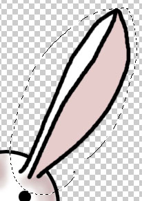 Before |
 During |
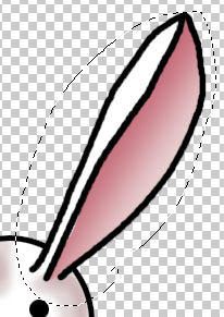 After |
Ta dah! You have now converted a simple sketch into a cute computer graphic. The starting and ending points are shown below, along with an image of the bunny with the outline made invisible so that you can see just the effect of the paint.
 Start |
 Finish |
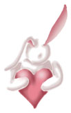 No Outline |
Lesson 7
Text
Playing with photos and drawings is all well and good, but one of the most fun parts of tinkering with pictures is putting captions on them. In fact, text itself can be turned into artwork, especially for things such as logos. In this lesson we will venture into the wonderful world of words.
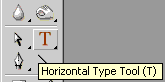 Open a new image and select the Horizontal Type tool (hereafter
abbreviated as simply "Type tool," since I only use the Vertical Type
tool for typing Japanese).
Open a new image and select the Horizontal Type tool (hereafter
abbreviated as simply "Type tool," since I only use the Vertical Type
tool for typing Japanese).
Next, look at the Type menu (right).
Item number one is the toggle icon that lets you switch between horizontal and vertical type. As I mentioned earlier, it is useful mainly if you are typing in Japanese and want the text to run vertically. If you try to use it with regular English text, all it does is rotate the text 90° clockwise.
 The second item is the pull-down menu that lets you select the font.
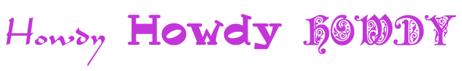
Personally, I use this menu more than just about anything else, because I
absolutely adore playing with different fonts. Choosing the
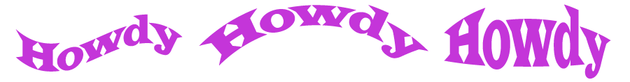
right font can really make your logo or caption come alive. For example,
look at the word "Howdy" written in three quite different fonts
(right)...which do you think best suits the word? Which would make the
viewer confused? Which one will be readable at the font size you intend
to use? There are lots of fonts out there for free download, so it's
worth doing a little web searching to find some that you like.
The second item is the pull-down menu that lets you select the font.
Personally, I use this menu more than just about anything else, because I
absolutely adore playing with different fonts. Choosing the
right font can really make your logo or caption come alive. For example,
look at the word "Howdy" written in three quite different fonts
(right)...which do you think best suits the word? Which would make the
viewer confused? Which one will be readable at the font size you intend
to use? There are lots of fonts out there for free download, so it's
worth doing a little web searching to find some that you like.The third item is a pull-down menu that allows you to select the font style if there is one available. Some fonts have styles such as bold or italic that you can choose, but many don't, so the usefulness of this varies.
Number four marks the pull-down menu governing font size. This is another extremely useful menu. You can use the choices on the menu, or you can type in a number if the option you want isn't available. If you highlight the number, you can increase or decrease one point at a time with the arrow keys while watching the effect on the text in the image. This lets you fine-tune exactly what size is best.
Number five is a pull-down menu that lets you change the anti-aliasing of the text. Anti-aliasing makes the borders of the letters smooth; with most other tools, this function is either on or off. With text, however, you have more choices as to how the smoothing is carried out. Each method makes the text appear slightly different. At large font sizes, you may not be able to tell, but at small font sizes (such as those used in captions for LiveJournal icons), the anti-aliasing can be the final factor determining whether or not the font is legible. I find that "strong" makes the text most clear at extremely small font sizes.
Sixth is the justification menu. The font that you type can be left-justified, centered, or right-justified with respect to the point on the image that you click.
Number seven is the color of the font. It is the foreground color by default, but you can change the font color by clicking on this box without changing the foreground color. Clicking the box opens the Color Picker.
Number eight is the icon that opens the "Warp Text" dialogue box. This has the effect of bending and twisting the text into different shapes as illustrated above.
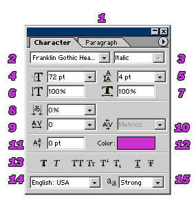 Last is the toggle icon for the Character palette (right). I cannot stress enough
how important it is to have the Character palette open when you are
working with text! In addition to the items in the menu bar, it has a
number of functions that make your work immensely easier.
Last is the toggle icon for the Character palette (right). I cannot stress enough
how important it is to have the Character palette open when you are
working with text! In addition to the items in the menu bar, it has a
number of functions that make your work immensely easier.- First, there is a tab that allows you to switch to the Paragraph palette. The functions on the Paragraph palette, such as justification and indentation, should be familiar to anyone who uses a word processor.
- Font. This is the same as the menu bar. Any changes made in one place will be reflected in the other.
- Style. This is also the same as the menu bar.
- Font size, again the same as the menu bar.
- Leading. This is one of the options I use most frequently. It allows you to set how much space there is between each line of text. By making this number smaller, it reduces the amount of blank space between lines. This is convenient because it allows you to fit more text in a limited space. You can also use it to spread lines farther apart.
- Vertically scale. With this function, you can increase or decrease the height of the font without affecting its width.
- Horizontally scale. This function increases or decreases the width of the font without affect its height.
- Tsume. This is a Japanese term for a function that scrunches characters closer together.
- Tracking. This is similar to tsume in that it can squeeze characters closer together, but it can also spread them farther apart. I use this function often when I want the text to take up less space yet reducing the font size would make it less readable.
- Kerning. This is a function that allows letters written at a slant, such as A and V, to fit snugly against each other, even though what you might call their "personal space" is overlapping. By default, most fonts will have automatic kerning. Turning the kerning off will force them farther apart.
- Baseline shift. This allows one section of a certain piece of text to be raised higher than the surrounding text by a specified distance.
- Color. This is the same as the menu bar.
- Font effects. These icons toggle font effects, such as underlining and superscripts. They should be familiar to anyone who uses word processing software. The one I want to mention in particular is the first icon, "Faux Bold." This allows the computer to simulate a bold version of the font even when the font itself doesn't have a bold version available. This can sometimes make fonts with very narrow lines more readable by broadening the lines. The second icon, "Faux Italic," does the same thing for italics, though I don't use it as much because if I want an italic font I will usually just choose one in the first place.
- Language. I never use this menu.
- Anti-aliasing. This is the same as the menu bar.
 Open the completed bunny image. In order to maximize the available
space, change the canvas size so that the width matches the height. (I
like my icons to be perfect squares.) When you do so, anchor the right
side of the picture. This provides a bit of space to the left of the
bunny for writing text.
Open the completed bunny image. In order to maximize the available
space, change the canvas size so that the width matches the height. (I
like my icons to be perfect squares.) When you do so, anchor the right
side of the picture. This provides a bit of space to the left of the
bunny for writing text.LiveJournal stipulates that icons can be no larger than 100 by 100 pixels, so reduce the image to this size. It is possible to write the text at a larger size and reduce the image afterward, but something that looks fine when large is often harder to read after being reduced. It's best to write the text at the final image size, if possible. The result should look like the picture (left).
The next step is to decide what text to use for the caption. It's a good idea to brainstorm a number of options and choose the one you like best. Here's a sample of my brainstorm list for this image:
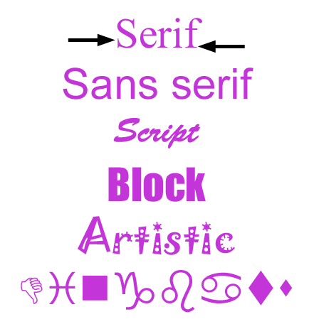 The next step is to choose an appropriate font. There are six major categories of fonts:
Serif fonts
These are fonts like Times that have small "serifs" (sticky-out bits) on the letters. The serifs are indicated by the black arrows in the picture (right). When reading long stretches of text, the serifs help guide your eyes smoothly from one letter to the next. This type of font also has a chiseled, professional look. At very small font sizes, however, the thin serifs tend to lose detail can can detract from readability.
Sans serif fonts
These are fonts such as Arial that lack serifs. They have a clean, simple appearance. They are good to use when you don't want the font to steal attention away from something else in the picture. They also tend to be readable even at smaller sizes. Unfortunately, they often aren't very exciting.
Script fonts
These fonts are designed to look like handwriting. The type of handwriting can vary from a simple scribble to elaborate calligraphy. The one pictured is called Brush Script. These fonts often have an elegant feel and are good for creating a mood, as in a caption for a romantic image. They are also excellent choices for dignified ceremonial text, such as on official certificates. Unfortunately, the flourished designs are almost always ruined at low font sizes. They need to be relatively large for the effect to be most appreciated.
Block fonts
Block fonts are thick and chunky. A notable example of this type is Impact. These fonts are good for logos and titles because they are extremely visible and easy to read. The drawback is that they often don't fit in small spaces.
Artistic fonts
These fonts were designed specifically to look non-standard. The one in the picture is called Jokerman. They are great for playful text, and there are fonts for all different moods, from sweet to wacky to scary. The drawbacks are that the fonts can sometimes be so specialized that it's hard to find effective outlets for them, and that they are frequently difficult to read because of all the decorations that have been added to the letters.
Dingbat fonts
These fonts, such as Wingdings, are not used for text. Instead of letters, you get symbols and icons and even detailed pictures when you type with them. They are very useful for adding decoration to spice up your image, but sometimes you have to search through many tiny symbols before finding one that suits your needs.
For the bunny icon, I want something that will match the picture, so it should be a font with a round and cuddly feel. That means I probably won't use a serif font or a block font. The first thing I do is type the caption and experiment by comparing different fonts to see which suits the icon best. Select the Type tool and click somewhere blank on the image. It doesn't really matter where you click; separate the cursor slightly from the text area and it will turn into a Move icon that you can use to adjust the position of the text at any time. At this point, don't worry too much about size or spacing, because that will come later. The pictures below show some of the fonts I considered.
 Abbey Medium Extended |
 Advert |
 AntsyPants |
 Boomerang |
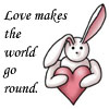 Monotype Corsiva |
 Forte MT |
 Kristen ITC |
 Now to fiddle with the size and placement of the letters. I don't want
to change the font size, because it's already very readable. However, it
overlaps the bunny slightly. Also, the comb-like nature of the right
edge of the text doesn't look very good. To fix this:
Now to fiddle with the size and placement of the letters. I don't want
to change the font size, because it's already very readable. However, it
overlaps the bunny slightly. Also, the comb-like nature of the right
edge of the text doesn't look very good. To fix this:
- Add some spaces in front of "the" and "go" to push them more toward the right.
- Change the "leading" property on the Character palette to push the word "round" farther down where it won't overlap the bunny.
- Set the "tracking" property to -50 to move the word "world" away from the bunny's ear.
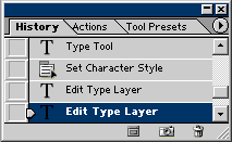 You should have the History palette open in your workspace, just above
the Layers palette. (If it's not there, open it now.) The History
palette keeps track of the most recent changes you make to your image,
as shown in the picture (left). The number of changes it keeps in memory
is specified by your user preferences. (I believe the default is 20.)
If you surpass this number, the oldest changes are bumped off the list
by the newer ones.
You should have the History palette open in your workspace, just above
the Layers palette. (If it's not there, open it now.) The History
palette keeps track of the most recent changes you make to your image,
as shown in the picture (left). The number of changes it keeps in memory
is specified by your user preferences. (I believe the default is 20.)
If you surpass this number, the oldest changes are bumped off the list
by the newer ones.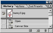 Clicking on one of the items in the History palette makes your image
revert back to that change. This is an extremely quick way to undo
multiple steps in an instant if you make a mistake or change your mind.
Scrolling all the way up to the beginning shows the oldest change to
which you can revert (right). In this case, the image hasn't had more
than 20 changes, so it goes all the way back to the point at which the
file was opened. Clicking on this first item is equivalent to closing
the file and reopening it, but much faster.
Clicking on one of the items in the History palette makes your image
revert back to that change. This is an extremely quick way to undo
multiple steps in an instant if you make a mistake or change your mind.
Scrolling all the way up to the beginning shows the oldest change to
which you can revert (right). In this case, the image hasn't had more
than 20 changes, so it goes all the way back to the point at which the
file was opened. Clicking on this first item is equivalent to closing
the file and reopening it, but much faster.Above the list item marked "Open" you should see a thumbnail picture. This is called a "snapshot." The snapshot is made automatically when you first open the file. You can always return at any time to this saved snapshot, even if you make so many changes that you push "Open" off the list. What's more, you can make your own snapshots at any time by clicking on the camera icon at the lower edge of the palette. This is like saving a document (or videogame) at a certain point so that you can go back to that point later if the changes you make afterward turn out to be unsatisfactory. This snapshots will never be pushed off the list, so you can rest assured that you can go back whenever you need.
Note: This does not actually save the picture itself! If you suffer a computer crash or blackout or other such problem, the History palette memory will be wiped as well. Don't rely on it to save your work-in-progress in that sense.
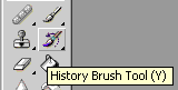 One further advantage of snapshots is that they can be used as a basis
for the History Brush tool (left). This tool does not "paint." Rather,
it is like "paint remover"; it replaces anything it touches with a
version of whatever was in that location at an earlier stage in the
image editing process. Think about an artist who has painted a picture
and then at a later date painted another picture over the top of it,
hiding the first one. The History Brush is equivalent to removing the
paint of the second picture, revealing the first one underneath.
One further advantage of snapshots is that they can be used as a basis
for the History Brush tool (left). This tool does not "paint." Rather,
it is like "paint remover"; it replaces anything it touches with a
version of whatever was in that location at an earlier stage in the
image editing process. Think about an artist who has painted a picture
and then at a later date painted another picture over the top of it,
hiding the first one. The History Brush is equivalent to removing the
paint of the second picture, revealing the first one underneath.The small icon of the brush with a counterclockwise arrow over it that is in the box to the left of the snapshot thumbnail in the History palette shows you from where the History Brush is drawing its properties. If you make more snapshots, you can click the box by one of the new snapshot thumbnails to set that as the basis for the History Brush instead.
Now back to the bunny picture. Click on the "Open" item in the History palette. This takes the bunny back to its original state. The nice thing is, the rest of the changes in the History palette remain the same until you erase them by performing a new action. If at this point you change your mind again and want to go back to the way you had the image the first time, you can scroll down and click on the last item on the History palette list, and there's no harm done. This is something you definitely can't do if you simply close/reopen the file. You can use this ability to toggle back and forth between an old version and new version of the image until you make up your mind which you like best. (This is something I do all the time.)
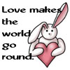
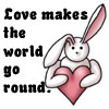
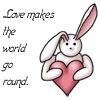
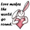
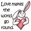
Change the canvas size of the bunny, but this time make it so that there's plenty of room around all sides for the words to fit. Then compress the image to 100 X 100 pixels. I want the caption to go all the way around the bunny, but the Warp Text function can only warp the words into a semi-circle at the most, so I will have to break the caption in half and handle each half separately.
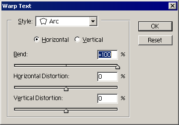 Type "Love makes the" and select the text, either by dragging the cursor
over it or by using the shortcut Ctrl + A for "select all." Click on
the Warp Text icon on the menu bar. This will bring up the "Warp Text"
dialogue box (left). I chose a bend value of +100% to make the text arc
in a complete semi-circle. When satisfied with the appearance of the
text, click "OK" or press Enter.
Type "Love makes the" and select the text, either by dragging the cursor
over it or by using the shortcut Ctrl + A for "select all." Click on
the Warp Text icon on the menu bar. This will bring up the "Warp Text"
dialogue box (left). I chose a bend value of +100% to make the text arc
in a complete semi-circle. When satisfied with the appearance of the
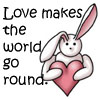
text, click "OK" or press Enter.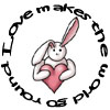 Accept the text by clicking on the check icon in the far right corner of
the menu bar, then repeat with the second half of the phrase. You may
have to fiddle with the font size and position to get it to fit
properly. If you want the words in the second half to be right-side-up,
choose a bend with a negative value. I wanted them to continue
upside-down, so I chose a positive value and then used Edit → Transform →
Rotate 180°. When you are finished, it should look like the picture on
the right.
Accept the text by clicking on the check icon in the far right corner of
the menu bar, then repeat with the second half of the phrase. You may
have to fiddle with the font size and position to get it to fit
properly. If you want the words in the second half to be right-side-up,
choose a bend with a negative value. I wanted them to continue
upside-down, so I chose a positive value and then used Edit → Transform →
Rotate 180°. When you are finished, it should look like the picture on
the right.There you have it! You now know how to add text to an image and manipulate the text into the size, shape, and position that you want.
Lesson 9
Blend Mode
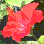
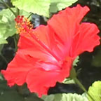
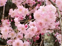
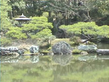
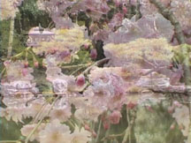
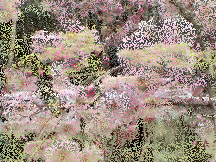
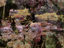
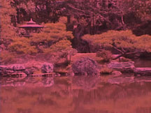
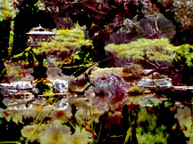
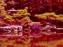
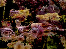
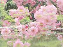
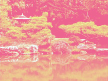
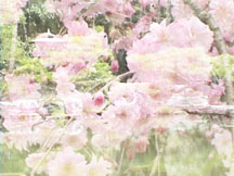
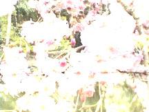
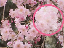
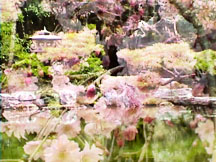
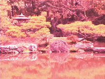
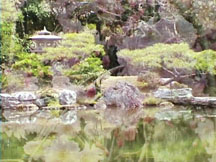
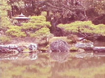
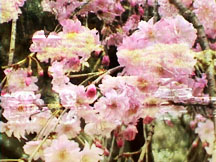
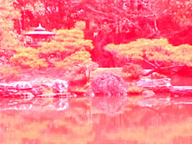
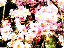
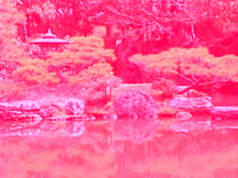
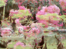
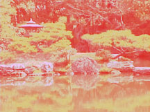
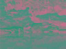
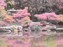
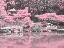
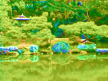
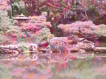
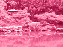
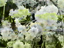
For the most part, in the lessons thus far, we have not touched much upon blend mode. If you stack one layer on top of another in the image, the layer on top obscures whatever is beneath it. This is the default, "Normal" blend mode. To see what is beneath the top picture, you have to reduce either the Opacity or the Fill of the layer, or else you must hide the top layer completely by toggling the visibility icon. In this lesson, you will see how to blend the top layer with the layer beneath it in various ways to achieve artistic effects. To demonstrate how blending layers works, I will use two pictures taken at the Imperial Palace in Kyoto during cherry blossom season. The effects of changing the blend mode are difficult to describe with words, so this lesson will rely heavily on example images. After I have shown what the different blend modes do, I will give some examples of how to use them to enhance your images.
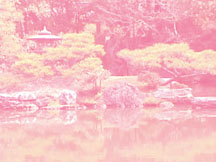
When the two pictures are stacked on top of each other in the same image in Normal mode, the result is as shown (below).
 Top |
+ |  Bottom |
= | Normal |
Top |
+ | Bottom |
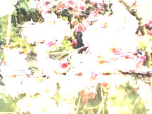
= |  Normal (Opacity: 50%) |
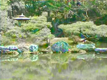
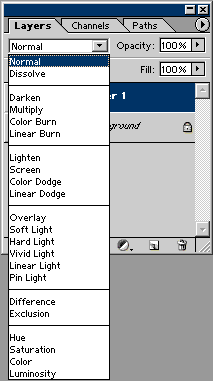 Click on the blend mode pull-down menu in the Layers palette (left).
There are many different blending options from which to choose, and they
all affect the layer differently. With the cherry blossom layer active
and still at 50% opacity, use this menu to change the mode from Normal
to Dissolve. The result is illustrated below.
Click on the blend mode pull-down menu in the Layers palette (left).
There are many different blending options from which to choose, and they
all affect the layer differently. With the cherry blossom layer active
and still at 50% opacity, use this menu to change the mode from Normal
to Dissolve. The result is illustrated below.Normal Opacity: 50% |
→ |  Dissolve Opacity: 50% |
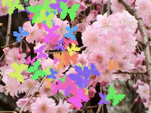 Here is the cherry blossom image with a series of butterflies painted
across it using the Brush tool (right). By putting the butterflies in
their own layer and setting the layer to Dissolve, the edges of the
butterflies are dithered rather than sharp.
Here is the cherry blossom image with a series of butterflies painted
across it using the Brush tool (right). By putting the butterflies in
their own layer and setting the layer to Dissolve, the edges of the
butterflies are dithered rather than sharp.The next item on the list, Darken, compares the pixel color of the top layer with the pixel color of the bottom layer and displays only the darker of the two (below).
Top |
+ | Bottom |
= |  Darken |
 Top |
+ | Bottom |
= | 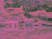 Darken |
Top |
+ | Bottom |
= |  Multiply |
Top |
+ | Bottom |
= |  Multiply |
Top |
+ | Bottom |
= |  Color Burn |
Top |
+ | Bottom |
= |  Color Burn |
Top |
+ | Bottom |
= |  Linear Burn |
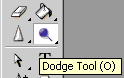
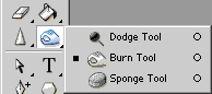 The Burn effect is not limited to blend mode. If you look at the
toolbar, you can see that there is also a Burn tool (left). This tool
makes whatever it touches darker. (The hand icon is to represent shading
an object with your hand before taking a photograph of it.)
The Burn effect is not limited to blend mode. If you look at the
toolbar, you can see that there is also a Burn tool (left). This tool
makes whatever it touches darker. (The hand icon is to represent shading
an object with your hand before taking a photograph of it.)Before |
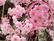 After |
These pictures show the result of using the Burn tool inside the area indicated by the pink circle (right). The next section of blend mode options is headed up by Lighten. This is the opposite of Darken. The two layers are compared, and the lighter pixel color is displayed (below). In this mode, black pixels in the top layer are effectively transparent.
Top |
+ | Bottom |
= |  Lighten |
Top |
+ | Bottom |
= |  Lighten |
Top |
+ | Bottom |
= |  Screen |
Top |
+ | Bottom |
= |  Screen |
Top |
+ | Bottom |
= |  Color Dodge |
Top |
+ | Bottom |
= |  Color Dodge |
Top |
+ | Bottom |
= |  Linear Dodge |
Top |
+ | Bottom |
= |  Linear Dodge |
Before |
 After |
The next section of the blend mode menu starts with Overlay. This mode combines Multiply and Screen modes. Where the bottom layer is dark, it uses Multiply mode, and where the bottom layer is light, it uses Screen mode. The effect is to make the darks darker and the lights lighter (below).
Top |
+ | Bottom |
= |  Overlay |
Top |
+ | Bottom |
= |  Overlay |
Top |
+ | Bottom |
= |  Soft Light |
Top |
+ | Bottom |
= |  Soft Light |
Top |
+ | Bottom |
= |  Hard Light |
Top |
+ | Bottom |
= |  Hard Light |
Top |
+ | Bottom |
= |  Vivid Light |
Top |
+ | Bottom |
= |  Vivid Light |
Top |
+ | Bottom |
= |  Linear Light |
Top |
+ | Bottom |
= |  Linear Light |
Top |
+ | Bottom |
= |  Pin Light |
Top |
+ | Bottom |
= |  Pin Light |
Top |
+ | Bottom |
= |  Difference |
Top |
+ | Bottom |
= |  Difference |
Top |
+ | Bottom |
= |  Exclusion |
Top |
+ | Bottom |
= |  Exclusion |
Top |
+ | Bottom |
= |  Hue |
Top |
+ | Bottom |
= |  Hue |
Top |
+ | Bottom |
= |  Saturation |
Top |
+ | Bottom |
= |  Saturation |
Top |
+ | Bottom |
= |  Color |
Top |
+ | Bottom |
= |  Color |
Top |
+ | Bottom |
= |  Luminosity |
Top |
+ | Bottom |
= |  Luminosity |
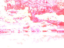
Let's say, for example, that there's one part of your image that you wish to emphasize with respect to the rest of the image. In the picture of the garden of the Imperial Palace, I may want to draw the observer's eyes to the lantern. Watch what happens when I add a layer on top of the lantern image that contains a simple black and white gradient drawn with the Gradient tool (below).
 Top |
+ | Bottom |
= | 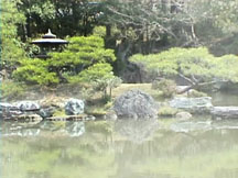 Soft Light |
Top |
+ | Bottom |
= | 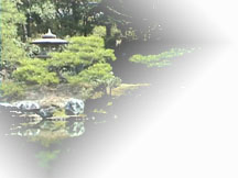 Lighten |
Top |
+ | Bottom |
= | 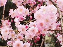 Overlay (Opacity: 75%) |
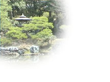 Top |
+ | Bottom |
= | 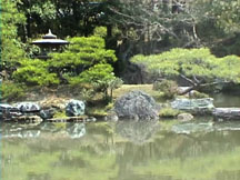 Multiply |
 Top |
+ | Bottom |
= | 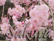 Luminosity |
 Top |
+ | 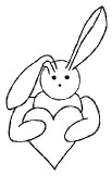 Bottom |
= | 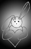 Exclusion |
No comments:
Post a Comment